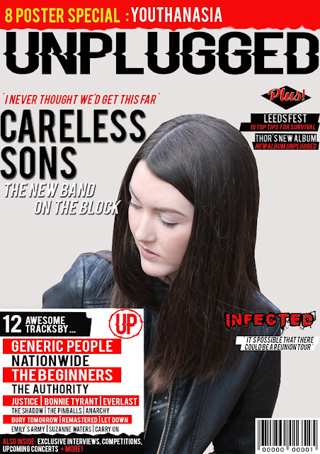
Draft 1:
Pros:
- The blank background contrasts with the different elements upon the page.
- It uses the left and right third for cover-lines.
- It features a lot of information.
- It sticks to the same font.
- You can clearly see the name of the magazine.
- You can see the main headline.
- It keeps to a colour scheme.
Cons:
- It looks blank in some areas.
- It needs more inset pictures.
- It needs to emphasise more on the headline story.
- Needs a graphic feature.
Draft 2:
Pros:
- Follows a colour scheme.
- Uses a lot of technical values that associate with other magazines (puffs, etc).
- It has good anchorage.
- It uses inset photos.
- The use of a location shot makes the magazine more personal.
- You can clearly see the name of the magazine.
- You can clearly see the main headline of the magazine.
- It has a clear house style.
Cons:
- It needs a graphic feature
- I need to give it some finishing touches and clean ups.
- I may add a menu strip at the bottom.
Draft 3:
Pros:
- It has a clear colour scheme.
- You can clearly see the title of the magazine and the headline.
- It uses both the left and right third of the magazine for cover lines.
- The colours are eye grabbing.
Cons:
- It has a lot of blank space.
- It needs a graphic feature.
- The colour can be quite bright to be able to read.
Ultimately, I believe I will go with draft #2, because it is the furthest developed, and I feel like when I add the finishing touches to it, it will look alike a real magazine cover.


No comments:
Post a Comment